A home makeover to create an aesthetic vibe is easy with these inspiring tips on Instagram.
TEXT: MORGAN AWYONG
PHOTOS: @OURFIRSVTHOME, RICE LAB, SHUTTERSTOCK, @LIGHKDARKSTARK_STUDIO, @JANNONKWAN & @LEMONFRIDGESTUDIO
If you’re looking to remodel your home, the good news is that finding inspiration to create your dream dwelling is easier than ever. However, renovating your home to fit a specific theme – like Japandi or Industrial – can take a hefty chunk out from your savings.
Rather than following trendy renovation themes blindly – that could soon fall out of style and date your home – why not pick up some makeover tips from Instagram itself?
For a more wallet-friendly makeover for instance, you could spruce up your existing home. Some of these changes just need a new piece of furniture, while others guide you on fundamentals that you can apply throughout your home.
CURVY IS IN
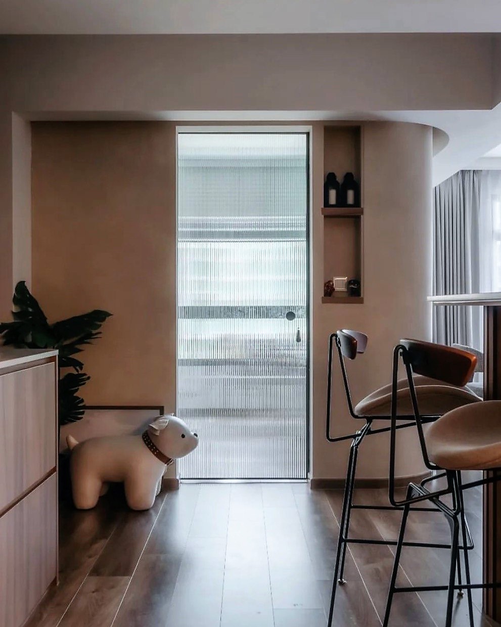
Putting a wall up can be a good thing, especially when it’s a curved one. These homeowners added a wall with a rounded edge to their main living space and it instantly elevated the feel.
Curved walls can help to soften the look of a space. It can serve as a design statement and add visual interest. They have strategically placed the curved corner at a central location, so it can transform the visual mood from multiple angles. And because the curve is only applied to the corner, the cost is reduced and occupies less space than a full wall. Plus, it’s safer if you have kids.
COLOUR STORIES
Architect Khai Toh believes that the best Insta-worthy shots work because of visual storytelling. You can do this in two ways: Adding a pop of contrasting colour to the existing home palette, or creating pockets of activity – like an armchair to read at.
The first is easy, and rather than just relying on furniture, consider items like paintings or a shelf of books to add dynamism to your pictures. Otherwise, you could also paint a single feature wall to add that visual interest.
The second works because the way the items are placed suggests an activity the homeowner partakes in. Khai explains: “What draws me into a picture is the used space; like half-open books or a pen by a sofa – as if someone had just left the spot”.
TILES HAVE CHANGED
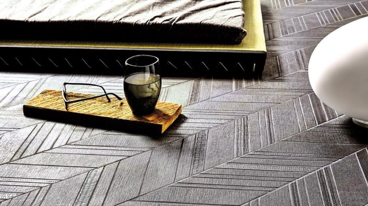
This company shows off the variety of possibilities available today, including sophisticated designs that appear seamless with clever visual illusions. Textures – unlike colours and forms – are often overlooked when designing homes, and you can include them easily with the right kind of tiles, even if it’s just in one room. Whether placed on the floor or a wall, their addition can transform a space, giving visual and tactile interest just by adjusting some lighting.
SERVE A THROW

Combining two of the earlier points about colour and texture, a throw can instantly elevate your existing home setup. These mini decorative blankets might not make much sense in their original function in sunny Singapore, but they can serve another purpose – as an added layer of protection against dust, grime and sunlight.
A throw can be placed on a sofa, armchair, bed or even a side table to add a pop of personality, and with the many designs and materials out there, you’ll likely find one that speaks to you and fits your home. You don’t even need to buy proper throws. Experiment with mufflers or scarves to get the same effect without spending too much.
EXPRESS YOURSELF
When designing a home, we can sometimes lose ourselves to a theme. Magazine and social media-inspired designs might be great but it can feel strangely cookie-cutter if it doesn’t align with your own lifestyle. For instance, a minimalist design theme might appeal to you but may not be realistic if you have three kids and a dog.
Don’t be afraid to inject your own personality with hybrid styles. A colourful dog bed or play station might be just what is needed to differentiate your white walls. Add your favourite sci-fi toy, crocheted cushion cover, vinyl record – these will give your home your unique visual signature.
LIGHTING IS EVERYTHING

The right kind of lighting can really impact in a photo, and it does so in three ways. First, having dedicated points of lighting can quickly add visual points of interest as well as suggest areas of activity, like a standing lamp by an armchair. Secondly, you can quickly transform the ambience with different lighting temperatures, especially with hue-changing bulbs.
Lighting can be statement pieces themselves. In this example, the off-kilter lights adds levity to the space with their playful angles. If fixed lightings are too fussy, consider portable versions and LED lighting strips to tuck light into neglected corners for depth and interest.
BRING HOME AN EMOTION
Sometimes the best inspiration comes from places you already love and know. Where’s your happy place? Is there somewhere you go to that makes you feel particularly relaxed?
Why spend all that money at (sometimes) overpriced cafes when you can recreate the café vibe at home? This local design installed a wall seating on one side of the dining table to simulate a cafe, with side embellishments. So be it a spa or bar or hotel room, let your favourite hangouts become your source of inspiration.
Combine one or more of these tips to spruce up your home, and see how easy it is to make it more photogenic. HomeTeamNS members can shop for more chic inspiration ideas at HipVan and enjoy 10 per cent off when they spend a minimum of $500 there.
Like our stories? Subscribe to our Frontline Digital newsletters now! Simply download the HomeTeamNS Mobile App and update your communication preference to ‘Receive Digital Frontline Magazine’, through the App Settings.

